A logo is about identity
A logo is the visual identity of the company or client. It represents what they do and any emotional messages that go with it.
Who is the client?
- What do they do?
- What are their goals and values?
- How do they perceive themselves?
- How do they want other people to perceive them?
Use the answers to these question to drive the design of the logo. Don’t try and fit their business into something that may look good but isn’t appropriate.
Who is the audience?
Is the primary audience teenagers or senior citizens? Are they interested in sports or arts and crafts? Also, who makes the final decision about the design? They probably have a vision of the end product so work to be congruent with that vision.
Keep it simple!
Use simple shapes that have a strong silhouette
Simple shapes such as squares, triangles and circles are the most effective and easiest to remember. If you’re not sure whether your logo has a strong shape, fill in the shape with black and observe it’s silhouette. Is the logo still recognizable?

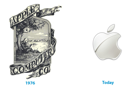
The apple logo is one of the most recognizable in the world. Due in large part to its simplicity.
Use appropriate colors
Keep the color palette congruent with your message. Too many colors convey conflicting messages.
For example, if you’re designing a logo for a dating website and you’re using blues, greens and yellows the user could confuse it with a conservation site. Reds, pinks and white would be more appropriate.
Make it the foundation of your design
The logo should set the tone for the rest of the design. For example, if your logo has round corners try using round corners in your interface.
A good way to get started is create a blank canvas and place the logo where you want. Then build the rest of the interface around it.
Be aware of emotional affiliations
Symbols
Symbols have strong emotional significance. If you’re designing for an international audience be sure to run your design by some people from your demographic. This way you avoid inadvertently pressing any buttons.
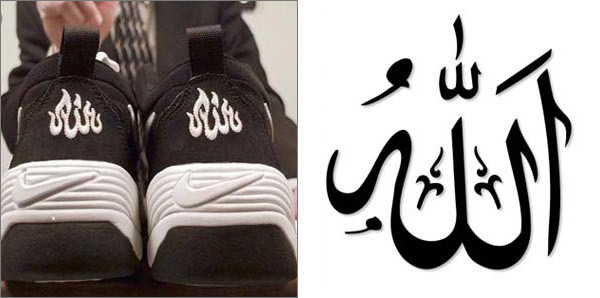
For example, in 1998, Nike released a new line of shoes called Nike Air Bakin. They quickly recalled them when Muslim American groups complained that the logo resembled the word “Allah” written in Arabic.

Nike had to recall 80,000 units costing them millions of dollars
Color
Colors also have emotional associations: blue is more soothing than red, green is more organic than gray.
Also, cultures view colors differently. In the United States red means danger, whereas in China, red means happiness. Research your audience before you make your decisions.
Design for different kinds of media
Is your logo going to be printed or is it going to sit on the computer screen? Make sure you know your client and where your logo will appear.
Television
Televisions (even large hdtvs) have a lower resolution than computer screens. Your very delicate details won’t appear as clear on a television than they would on a computer.
Color looks darker on paper than on the computer screen. It’s also rendered in CMYK (Cyan, Magenta, Yellow, Key) and not RGB (Red, Green, Blue). Like the television, print can’t keep the kind of details that you would see on a computer screen so keep your shapes as simple as possible.
Black and White
It might not necessarily be in color either (newspapers, yellow pages, fliers etc) so have a high contrast to make it easily recognizable.
Design for the future
We are constantly bombarded by products and services often linked with a logo that leaves little or no impact. Your logo should withstand the test of time.
Design a logo that transcends any stylistic trends. If not it will soon and seem quaint and need a redesign. A redesign could potentially hurt the brand because people would lose that familiar affiliation.

The pirate logo has changed very little over the last 400 years
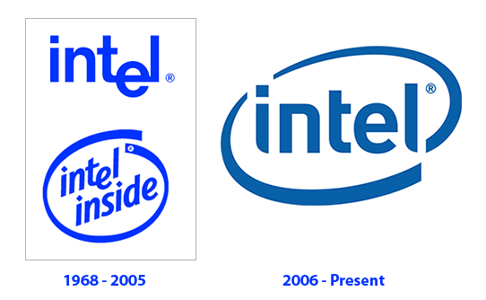
However, it’s also natural to “upgrade” a logo over time. By upgrading a logo you’re keeping the essence while making it more modern.

Notice that Intel kept the essence of their logo
Understand the difference between upgrade and change. When you change a logo you change the identity, when you upgrade a logo you improve the identity.
Further reading
History of various famous logos
Comments
Post by Web Design Kuwait on June 4, 2009
nice post, thanks for the info