Design your home page around the content, not the other way around.
The home page should compliment the content. It’s very easy to let the aesthetics overpower content and usability. Especially when the home page is put in the hands of an inexperienced designer.
Establish an Identity
The first time a user looks at your website you should quickly answer these four questions.
- Who you are
- What you do
- What you have
- Why this site is better than another
Convey a Personality
Using adjectives how would you describe your site?
Jot down a list of adjectives to describe your site. These adjectives will help set the personality and drive the look and feel of the home page.
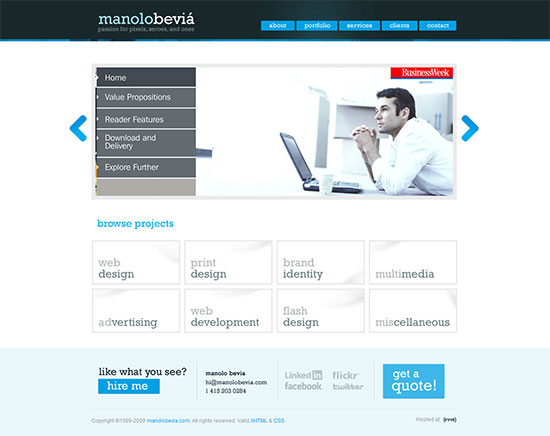
The portfolio site of Manolo Beviá
What adjectives would you use to describe the home page above?
I would use some of the following:
- Clean
- Professional
- Minimalistic
- Cool
- Refreshing
- Confident
- Web 2.0
How would your writing style reflect your personality?
Your tone and choice of words should also be congruent with the personality. For example, a website for a library is going to much more formal than that for kids.
Establish a Hierarchy
Show them where to start.
Your website can be confusing the first time someone visits it. (Especially if it’s a large website). Establish some visual clues to get them started. Make your navigation clear and highlight any points of interest that you want them to see. You could even create a big button that simply says “start here”.
Use the visitor’s words.
Chances are, your business uses jargon that every employee knows like the back of their hand. On the web however, NO ONE understands your jargon! Use everyday words that everyone knows. Better yet, hold some usability tests and find out for sure if any words are confusing or unclear.
The home page can be different from the rest of the site.
The home page doesn’t have to share the same layout as the rest of the site. In fact, you will probably have to change the layout anyway because the home page serves a different purpose.
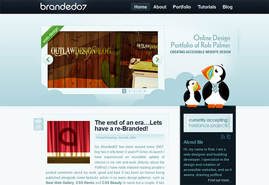
The background on the home page takes up more real estate than the other pages.
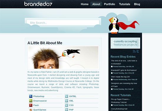
On the about page the background shrinks to allow more space for content.
Note that in the example above, the two pages change but the overall look and feel remain the same. Be sure to maintain consistency on all pages.
Give them what they’re looking for.
Have shortcuts to useful content.
Keep your users objectives at the forefront of your design and have links to your most popular content. They aren’t going to spend time admiring the subtle aspects of your home page, they just want the content.
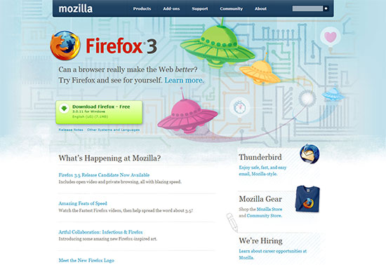
The "Download Firefox" button is clearly visible on the Mozilla home page.
Provide timely content.
Provide any timely content and put it in a highly visible area. This shows the users that your the site is up to date. This is particularly true when designing for products, newspapers or blogs. But it can be applied pretty much anywhere.
People don’t read, they scan.
Don’t use paragraphs to identify the site.
People will never read your finely crafted paragraphs on your home page. Instead, use these three things.
- Logo
- Name
- Tag line
Chris Jennings does a fine job of doing this.
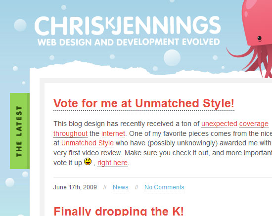
On chrisjennings.com you know exactly who he is and what he does. Without reading a long paragraph.
Links and short descriptions.
When you think home page, think “links and short descriptions.” All your content should be easily visible with just a glance. If the link entices them then they will read the short description below it.
The “welcome” blurb.
As a rule, try to avoid using a “welcome” blurb. Most users are very familiar with them and immediately skip them because usually the welcome blurb has little or no useful information.
However, if you do find yourself needing a welcome blurb then keep it short and to the point. It should never be more than one sentence long!

This welcome blurb isn't terrible, the title is large and the links are clearly visible. However, shortening it by five lines would go a long way.

People are much more likely to read this welcome text.
Don’t overload the home page
The home page must appeal to the widest audience within your niche. Therefore it’s tempting to cram it with tons of information.
Don’t do this.
Too much information will clutter your home page and make it harder to understand. The less they have to process the better.
What are your thoughts?
Have any ideas on how to improve the home page?
Comments
Post by manolo bevia on June 29, 2009
THIS IS A GREAT ARTICLE!!! THANKS!
Post by فوتوشوب on June 30, 2009
Fantastic ... Thanks
Post by Rolly on July 3, 2009
Nice... very nice... keep up the good work... :-)