Note: This is a rather advanced tutorial so if you have never encountered classes and OOP
(Object Oriented Programming) before I encourage you to read up on it a bit and then come back.
What you will need
- A server with php installed and gdLibrary enabled.
- A pure text editor, I like Eclipse
The Source
Download the commented source code to this tutorial.
Part One: Initializing your new class and setting variables.
Open up your favorite script editor
Create a new file and name it line_chart.php
Copy the following code and paste it into your new php document.
class line_chart
{
//--------------------------------------------
// variables
//--------------------------------------------

// The chart labels
var $chart_title    = "Web Site Hits";
var $x_label	    = "Date";
var $y_label 	    = "Hits";

//The dimensions of your chart
var $chart_width     = 500;
var $chart_height    = 300;

//The perimeter of  your chart
var $chart_perimeter = 50;

//The data that you want to be plotted
var $data_array      = array();

//Your color array
var $color 			= array();
}//end of class
Part Two: The “Set” Methods
While working in OOP it is good practice to create set methods that will (as you might expect) set your variables.
Copy the following code and paste it into your document under the variables that you just created.
//--------------------------------------------
// set chart dimensions
// This function sets the dimensions of your chart. Right now they are set to default 500x300 but later
// you'll be able to use this function to change the dimensions to whatever you want.
//--------------------------------------------
public function set_chart_dimensions($width, $height)
{
$this->chart_width  = $width;
$this->chart_height = $height;
}
//--------------------------------------------
// set chart perimeter
// This function sets the width of the perimeter, you can make the perimeter larger or smaller by passing
// a higher or lower integer.
//--------------------------------------------
public function set_chart_perimeter($perimeter)
{
$this->perimeter = $perimeter;
}
//--------------------------------------------
// set labels
// This function sets the labels for your graph. You can also remove your labels by setting each value to an
// empty string ( "" )
//--------------------------------------------
public function set_labels($title, $xLabel, $yLabel)
{
$this->graphTitle = $title;
$this->xLabel     = $xLabel;
$this->yLabel     = $yLabel;
}
//--------------------------------------------
// add line
// This function passes an array of information to your data_array. This data will be plotted
// note that I'm using brackets [], this will let me have multiple lines on a graph. (great for making comparisons)
//--------------------------------------------
public function add_line($new_data)
{
$this->data_array[] = $new_data;
}
Part Three: Preparing the canvas
All the setup is done, now its time to actually start programming! The first step is creating your canvas so let’s get to it.
Go back into your class, copy and paste the following code below your add_line() function.
//--------------------------------------------
// prepare canvas
//--------------------------------------------
private function prepare_canvas()
{
//this->chart is the variable that will store your image. It is the canvas for all of your work.
$this->chart = imagecreatetruecolor($this->chart_width, $this->chart_height);

//By default the canvas only comes with one color. . black (which really isn't a color at all, it's the absence of color :P) anyway
//it would be memory intensive for php to automatically allocate every color into memory (as there are millions of colors)
//so we must do each manually.

$this->color['white']     = imagecolorallocate($this->chart, 255, 255, 255);
$this->color['black']     = imagecolorallocate($this->chart, 0,0,0);
$this->color['yellow']    = imagecolorallocate($this->chart, 248, 255, 190);
$this->color['blue']      = imagecolorallocate($this->chart, 3,12,94);
$this->color['gray']      = imagecolorallocate($this->chart, 102, 102, 102);
$this->color['lightGray'] = imagecolorallocate($this->chart, 216, 216, 216);

//later when we want to adjust the position of our fonts we'll need to know the width and height.
//I'm setting my font size to 2.
$this->font_width  = imagefontwidth(2);
$this->font_height = imagefontheight(2);

//This function as you might expect, fills the canvas with a color. In this case, I'm filling it with light gray
imagefill($this->chart, 0,0, $this->color['lightGray']);
}
Part Four: Calculating the maximum and minimum Y values.
In this next part we need to find a maximum and minimum value for the Y-Axis. We could just take the maximum and minimum value in our array (608 and 108) but then the line would go right to the edge and not look very good.
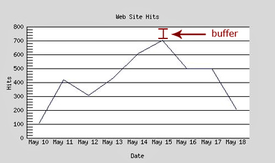
So let’s create a buffer.
Copy and paste the following code into your document below the previous function.
//--------------------------------------------
// get min and max y values
//--------------------------------------------
private function calculate_min_and_max_y_values()
{

//because we might have multiple lines of data (multiple arrays),
//we'll need to search through all of them in order to find the
//highest and lowest value.

for($i=0; $idata_array); $i++)
{
$current_line = $this->data_array[$i];
if( min($current_line)>$y_min ) $y_min = min($current_line);
if( max($current_line)>$y_max ) $y_max = max($current_line);
}

//min
$places   = strlen($y_min);				//string length of minimum value. 		  		  so strlen(1) = 1;
$mod      = pow(10, $places-1); 	    //raising that number minus 1 to the power of 10. so pow(10, 0) = 1;
$y_min    = $mod - $y_min; 				//subtracting that from the minimum. 			  so 1 - 1 = 0; <-your y-axis minimum

//We can't have negative hits so if $y_min is less than 0 we
//just set that to 0.
if($y_min<0) $y_min = 0;

//max
$places = strlen($y_max);
$mod    = pow(10, $places-1);
$y_max 	= $mod + $y_max;

//Saving this mod value to a class variable
//(it will be useful later)
$this->mod = $mod;

//Saving the $y_min and $y_max values so that they can be
//accessed by a different method in the class.

$this->y_axis_values['min'] = $y_min;
$this->y_axis_values['max'] = $y_max;
}
Part Five: Preparing the Grid
Ok prepare yourself, this is going to be the hardest part of the tutorial. But don’t be afraid, it’s not too hard. What we need to do next is create a grid on which we can draw our chart.
Remember the perimeter that you assigned earlier? Well that’s where this comes in. The perimeter acts as a buffer between the edge of your canvas and the grid its self. The perimeter will also be the place where you put your chart labels.
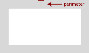
I’m going to break up the next function into chunks and explain what they do as we go along.
Copy and paste the following code in to your document.
private function prepare_grid()
{

//The grid width. We don't want the grid to be the same size as the chart otherwise the entire
//document will be just one grid with no place for labels. Therefore, subtract the perimeter width from all sides.
$gridWidth  = $this->chart_width  - ($this->chart_perimeter*2);
$gridHeight = $this->chart_height - ($this->chart_perimeter*2);

//I prefer to work with coordinates, it makes it easy to visualize the process. If you observe below you'll see
//That I've made four corners.
$this->c1 = array("x"=>$this->chart_perimeter,             "y"=>$this->chart_perimeter);
$this->c2 = array("x"=>$this->chart_perimeter+$gridWidth,  "y"=>$this->chart_perimeter);
$this->c3 = array("x"=>$this->chart_perimeter+$gridWidth,  "y"=>$this->chart_perimeter+$gridHeight);
$this->c4 = array("x"=>$this->chart_perimeter,             "y"=>$this->chart_perimeter+$gridHeight);
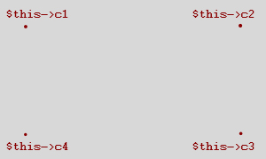
Go ahead and copy and paste the following code below your previous.
//now that I've made the grid coordinates its time to connect the dots and create a grid plane.
//In this function I'm creating a solid white rectangle
imagefilledrectangle($this->chart, $this->c1['x'], $this->c1['y'], $this->c3['x'], $this->c3['y'], $this->color['white']);
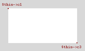
More copying and pasting.
//getting the biggest array
//now I need to find the highest x-value but unlike the y-value that I found earlier, I'm not trying to find
//the highest data value but rather the highest count value.
//To put it simply, which array has the most entries?

$biggest_array = array();
for($i=0; $idata_array); $i++)
{
if(count($biggest_array) < count($this->data_array[$i])) $biggest_array = $this->data_array[$i];
}
I’m going to increment by grid units so I need to find what the width and height of that grid unit is (in pixels)
and again. . .
$this->square['w'] = $gridWidth/count($biggest_array);
$this->square['h'] = $gridHeight/$this->y_axis_values['max'];
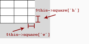
I also want some padding between the first line and the left side of the graph, otherwise the chart won’t
look that great.

$this->vertical_padding = $this->square['w']/2;
Copy and paste the following code
//------------------------------------------------
//drawing the vertical lines and axis labels
//------------------------------------------------
foreach($biggest_array as $assoc=>$value)
{
//drawing the line
imageline($this->chart,  $this->vertical_padding+$this->c4['x']+$increment,   $this->c4['y'], $this->vertical_padding+$this->c1['x']+$increment, $this->c1['y'], $this->color['black']);

//axis values
//finding the width of the word so that we can accuratly position it
$wordWidth = strlen($assoc)*$this->font_width;

//the x-position of the line, this will be incremented on every loop
$xPos = $this->c4['x']+$increment+$this->vertical_padding-($wordWidth/2);

//creating the axis value label
ImageString($this->chart, 2, $xPos, $this->c4['y'], $assoc, $this->color['black']);

$increment += $this->square['w'];
}
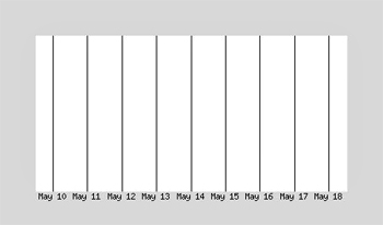
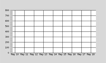
Next we need to create the horizontel lines to finish up our grid. Copy and paste the following code.
//------------------------------------------------
//drawing the horizontel lines and axis labels
//------------------------------------------------
//resetting the increment back to 0
$increment = 0;
for($i=$this->y_axis_values['min']; $i<$this->y_axis_values['max']; $i++)
{
//main lines
//often the y-values can be in the thousands, if this is the case then we don't want to draw every single
//line so we need to make sure that a line is only drawn every 50 or 100 units.
if($i%$this->mod==0){
//drawing the line
imageline($this->chart, $this->c4['x'], $this->c4['y']+$increment, $this->c3['x'], $this->c3['y']+$increment, $this->color['grey']);
//axis values
$xPos = $this->c1['x']-($this->font_width*strlen($i))-5;
ImageString($this->chart, 2, $xPos, $this->c4['y']+$increment-($this->font_height/2), $i, $this->color['black']);
}
//tics
//these are the smaller lines between the longer, main lines.
elseif(($this->mod/5)>1 &amp;amp;amp;amp;amp;amp;amp;amp;amp;&amp;amp;amp;amp;amp;amp;amp;amp;amp; $i%($this->mod/5)==0)
{
imageline($this->chart, $this->c4['x'], $this->c4['y']+$increment, $this->c4['x']+10, $this->c4['y']+$increment, $this->color['grey']);
}
$increment-=$this->square['h'];
}
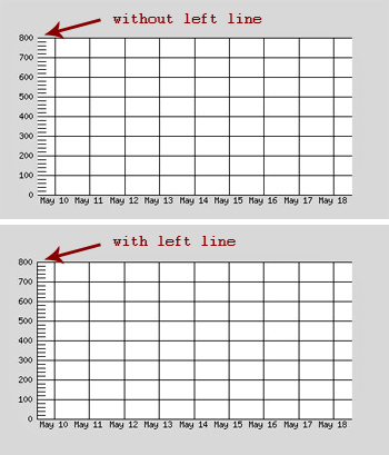
//------------------------------------------------
//creating the left line
//------------------------------------------------
imageline($this->chart, $this->c1['x'], $this->c1['y'], $this->c4['x'], $this->c4['y'], $this->color['black']);
}//end of prepare_grid function
I also added a left line to make it look better.
Part Six: Drawing the axis labels
Every chart needs to have some chart labels so let’s add some!
Copy and paste the following code.
private function draw_chart_labels()
{
//------------------------------------------------
// Making the chart labels
//------------------------------------------------

//Graph Title
ImageString(
$this->chart, 2,
($this->chart_width/2)-(strlen($this->chart_title)*$this->font_width)/2, $this->c1['y']-($this->chart_perimeter/2),
$this->chart_title,
$this->color['green']);

//X-Axis
ImageString(
$this->chart, 2,
($this->chart_width/2)-(strlen($this->x_label)*$this->font_width)/2,  $this->c4['y']+($this->chart_perimeter/2),
$this->x_label,
$this->color['green']);

//Y-Axis
ImageStringUp(
$this->chart, 2,
$this->c1['x']-$this->font_height*3, $this->chart_height/2+(strlen($this->y_label)*$this->font_width)/2,
$this->y_label,
$this->color['green']);
}
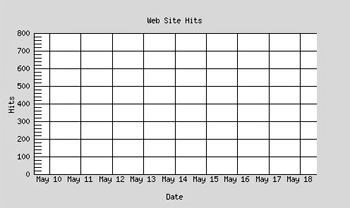
Here is the chart with the labels.
Part Seven: Plotting the lines.
You’ve come a long way! Congratulations! There are only a few steps left before you’ll be frolicking in graph goodness!
Lets do what you’ve been waiting for, plotting the lines on your new chart.
Copy and paste as always.
//--------------------------------------------
// plot lines
//--------------------------------------------
private function plot_lines()
{
//------------------------------------------------
// Making chart lines
//------------------------------------------------
$increment = 0; 		//resetting the increment value

//looping through each array of data
//(in this case there is only one set of data
//but later you'll be able to add more)
for($i=0; $idata_array); $i++)
{

$line = $this->data_array[$i];
//getting the first value
$firstVal = end(array_reverse($line));

$increment = 0;
//getting the first point for your line
$point1 = array($this->c4['x']+$increment+$this->vertical_padding,$this->c4['y']-($firstVal*$this->square['h']));

//looping through your current array of data
foreach($line as $assoc=>$value)
{
//getting the second point for your line
$yPos 	= $this->c4['y']-($value*$this->square['h']);
$xPos 	= $this->c4['x']+$increment+$this->vertical_padding;
$point2 = array($xPos, $yPos);

//drawing your line
imageline($this->chart, $point1[0], $point1[1], $point2[0], $point2[1], $this->color['blue']);

//point1 becomes point2
$point1 = $point2;

//increment to the next x position
$increment += $this->square['w'];
}
}
}
Part Eight: The output function
Guess what . . you’re almost done!
Copy and paste this simple function
//--------------------------------------------
// output
//--------------------------------------------
private function output()
{
//sets the type of output (in this case a jpg image)
header("content-type: image/jpg");
imagejpeg($this->chart);

//after output it removes the image from the buffer to free up memory
imagedestroy($this->chart);
}
Part Nine: The plot function.
All right time for the last function. Thankfully this one is REALLY easy. Just copy and paste as usual. (make sure that
they are in this exact order).
//--------------------------------------------
// plot
//--------------------------------------------
public function plot()
{
$this->prepare_canvas();
$this->calculate_min_and_max_y_values();
$this->prepare_grid();
$this->plot_lines();
$this->draw_chart_labels();
$this->output();
}
Notice that these are all the functions that you just made? Pretty much in order too. This is the essence of modular and the power of classes. Now it is very easy to debug for if we have a problem we can just go through and comment out those functions in order to isolate it.
Part Ten: Creating an instance of your new class.
Ok all the hard work is done, now for the fun part.
Copy and paste the following code after the closing curly-bracket of your class (where it says //end of class)
//Your Chart Data (this is what will be plotted)
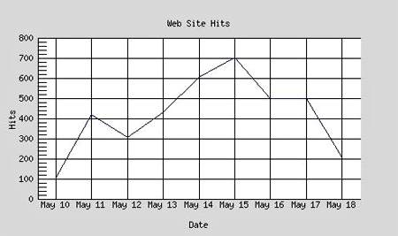
$data['May 10'] = 108;
$data['May 11'] = 419;
$data['May 12'] = 305;
$data['May 13'] = 433;
$data['May 14'] = 608;
$data['May 15'] = 702;
$data['May 16'] = 498;
$data['May 17'] = 500;
$data['May 18'] = 208;

//creates a new instance of your line_chart class
$myChart = new line_chart;

//set the dimensions of your chart
$myChart->set_chart_dimensions(500,300);

//set the perimeter of your chart
$myChart->set_chart_perimeter(50);

//set the different chart labels
$myChart->set_labels("My Title", "My X-Label", "My Y-Label");

//this references your add_line function and sets your data
$myChart->add_line($data);

//outputs your chart;
$myChart->plot();
See how easy and compact that is? With just six lines of code you created a line chart! Amazing! You can also just do it with three, simply remove the set_chart_dimensions, set_labels and set_chart_perimeter functions and it will grab the default values.
This is the final result of all our hard work!
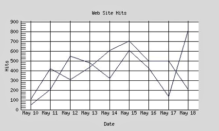
And look what happens when I pass it another array of data!
Conclusion:
Go ahead and add some more features. Perhaps write a function that will set the color of the line or the background. The sky is the limit!
I hope this tutorial was helpful, feel free to post any comments or questions you may have.
Comments
Post by John Giotta on February 5, 2009
Part 5 looks like it got garbled... any change you can fix it?
Post by Vish on April 8, 2009
Nice tutorial but little hard to code
Post by Supreme Web Solutions on May 4, 2009
Brilliant tutorial, well put together and great code. This is my first attempt at GD graphs and with your help it has been a success, one thing though - I want t o put in a parameter to set if the values on the Y axis should be round() or not. Before I do it have you already done this to save me the time? Thought I had lost this site but it seems to have been re designed, nice job to your web designer!
Post by Joshua Bolduc on May 4, 2009
Hello Supreme Web Solutions, All the work I've done for this tutorial is included in the source file at top. I'm glad you like the new design. It took me forever to get right :)