Part 6: Creating the home page
The home page is different from the rest of your site, it has to communicate as much as possible in the shortest amount of time. It’s kind of like a road map that guides your users to the rest of the site.
Therefore, it’s not that uncommon to see the home page take a dramatically different approach especially when it comes to layout.
Because the change in layout only happens on one page it’s OK to create a separate css file and use specialized divs. In fact, it’s preferred because then the other pages don’t have to load it.
Step 1: Change the page title
1. Open index.htm
2. Change the page title to Home
<title>Home</title>
Step 2: Link the home.css file
1. Inside the <head> tag, paste the following code between general.css and favicon.ico
<link rel = "stylesheet" media = "screen" href = "css/layout.css" />
<link rel = "stylesheet" media = "screen" href = "css/typography.css" />
<link rel = "stylesheet" media = "screen" href = "css/general.css" />
<link rel = "stylesheet" media = "screen" href = "css/home.css" />
<link rel = "Shortcut Icon" href = "images/favicon.ico" />
2.Save index.htm
Step 3: Add the photo
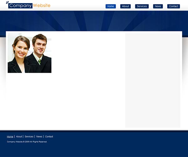
In the next step we’re going to create the top row div and add the photograph of the man and woman.
1. Paste the following code inside the #contenttag.
    <div id = "top">
        <div id = "photo">
            <img src = "images/photo.jpg" alt = ""/>
        </div>
    </div>
2. Open home.css
3. Paste the following code into home.css
/*======================
	TOP
========================*/
/*
The home page is broken up into two rows. Each row is being
wrapped by a #top and #bottom div.
*/
#top
{
	float:left;
	margin-bottom:1px;
}
/*
The #photo div controls the placement and dimensions of the image.
*/
#photo
{
	float:left;
	margin-right:1px;
	width:238px;
	height:217px;
	border:0;
}
/* Disables the border */
#photo img{ border: 0 }
4. It should look look like this:
Step 4: Add the welcome text
1. Add the following to index.htm, right below #photo
 <div id = "intro">

    <div id = "welcome">
        <h1>Our Company Is. . .</h1>
        <p>Lorem ipsum dolor sit amet, consectetuer adipiscing elit. Praesent mollis ligula eu ante. Nulla sed felis eu tellus malesuada dapibus. Donec ac quam. </p>
        <p>Curabitur sapien. Curabitur sagittis, risus eu interdum gravida, dui ligula aliquet enim, dictum ultricies felis erat quis est.</p>
        <p><a href = "">Learn More</a></p>
    </div>

</div>
2. Paste the following code inside home.css
/*
This sets the landscape background image and sets the width
and height of the #into div
*/
#intro
{
	background:url(../images/intro_background.jpg) no-repeat;
	float:left;
	margin-left:1px;
	height:217px;
	width:700px;
}
/*
I wanted the welcome text to be specifically placed and I didn't
want it to go too far to the right so I wrapped it in its own
#welcome div.
*/
#welcome
{
	float:left;
	width:370px;
	height:140px;
	position:relative;
	left:25px;
	top:30px;
}
/*
H1 is a very important heading for SEO, for this reason I
still wantedto use it for my home page but didn't want to
use the default styling for it. So I just created some custom
styling for the home page.
*/
#welcome h1
{
	color:#127e00; font-size:22px; margin: 0 0 15px 0; line-height:1; padding:0; font-weight:700; background:0;
}
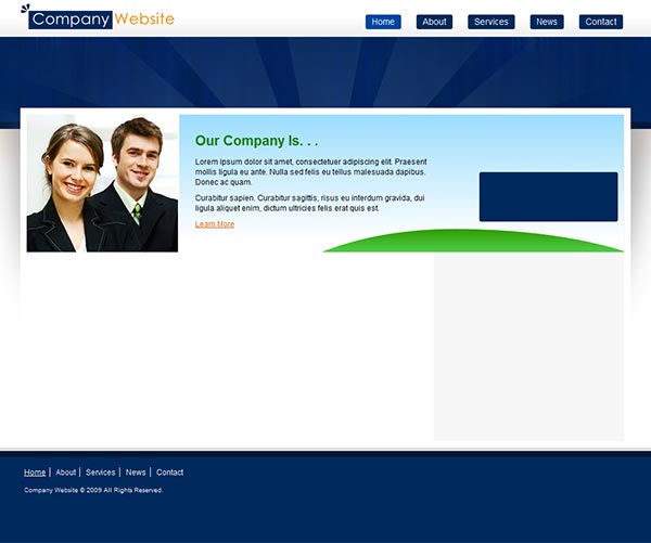
3. It should look like this when you’re done
Step 5: Add the phone number
1. Paste the following code below #welcome
<div id = "phone">
    <span>Call us Toll Free:</span>
    <h2>1-800-555-INFO</h2>
</div>
2. Paste the following code into home.css
/*
Like on #welcome I wanted the #phone to be specifically
placed.
*/
#phone
{
	float:left;
	width:150px;
	height:40px;
	position:relative;
	left:115px;
	top:32px;
}
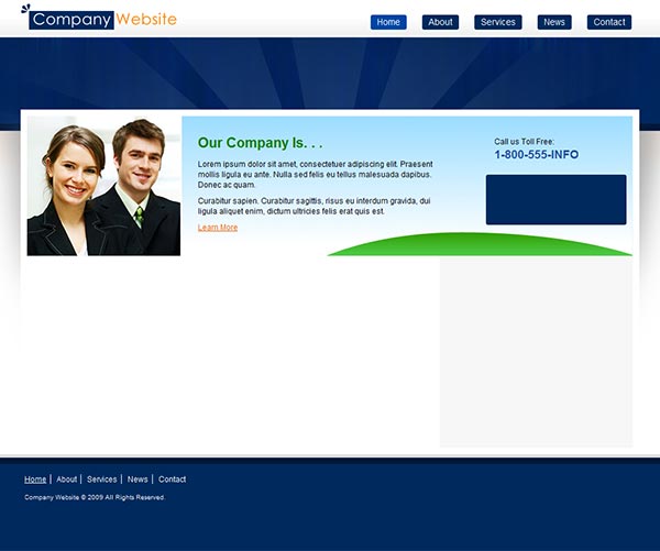
3. It should look like this
Step 6: Add the newsletter form
1. Paste the following into index.htm below #phone
<div id = "newsletter">
    <span>Sign up for our newsletter!</span>
    <input type = "text" name = "" value = "Your Email. . ."  /><input type = "submit" class = "signup" value = ""/>
</div>
2. Open home.cssand paste the following below #phone
/*
Newslwetter is also specifically placed
*/
#newsletter
{
	float:left;
	width:200px;
	height:55px;
	padding:10px 0px 10px 15px;
	position:relative;
	left:102px;
	top:52px;
}
/*
I used a span because I wanted to style the text but I didn't
want to give it extra emphasis to the search engines.
*/
#newsletter span
{
	display:block;
	margin-bottom:7px;
	font-size:14px;
	color:#fff;
}
/*
In this case I wanted the input element to be the same
across all browsers so I opted to assign it a width instead
of using the traditional 'size' attribute.
*/
#newsletter input
{
	width:120px;
	margin: 0 2px 0 2px;
	padding:3px;
	font-size:10px;
}
/*
The submit element gets a special style
*/
#newsletter input.signup
{
	background:url(../images/sign_up_btn.png) no-repeat;
	margin:0;
	border:0;
	width:54px;
	height: 21px;
}
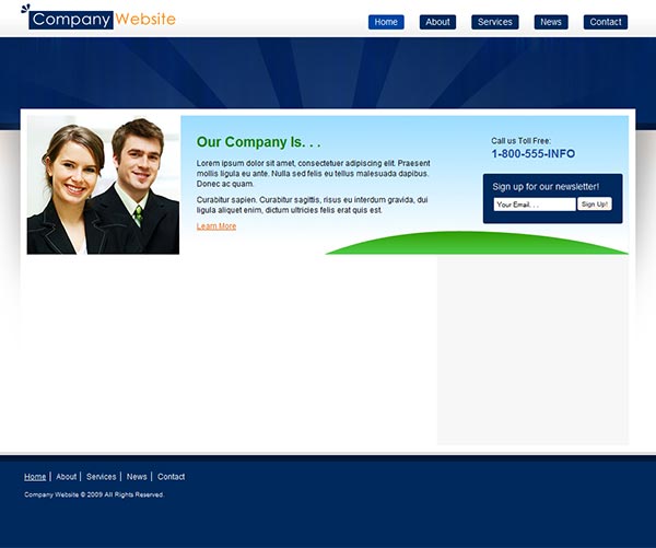
3. It should look like this
The top row is finished now let’s do the bottom row!
Step 7: Add the testimonials
1. Add the following code to index.htm below the #top div.
<div id = "bottom">
    <div id = "testimonials">
        <h3>Testimonials</h3>
        <div class = "content">
            <blockquote>
            <p>Lorem ipsum dolor sit amet, consectetuer adipiscing elit. In placerat metus egestas.</p>
            <span>Anonymous</span>
           </blockquote>

            <blockquote>
            <p>Lorem ipsum dolor sit amet, consectetuer adipiscing elit. Curabitur vitae.</p>
            <span>Anonymous</span>
           </blockquote>

             <blockquote>
            <p>Lorem ipsum dolor sit amet, consectetue.</p>
            <span>Anonymous</span>
           </blockquote>
        </div>
    </div>
</div>
2. Add the following code to home.css
/*======================
	BOTTOM
========================*/
/*
This wraps the bottom layout and ads the two-column gray background
*/
#bottom
{
	background:url(../images/home_content_background.gif) repeat-y;
	float:left;
	margin-top:1px;
}
/*
Each h3 element inherits the global styles that are set in
typography.css, I wanted to change them all to a different style.
*/
#testimonials h3, #what-we-offer h3, #recent-events h3{  padding: 10px; font-size:14px; color:#fff; font-weight:700; }

/*
Each element has the same text styles but different background
styles.
*/
#testimonials h3{ background:#2451a0 }
#what-we-offer h3{ background:#ff8401; }
#recent-events h3{ background:#2451a0 }
/*
This positionns the #testimonial divs
*/
#testimonials
{
	float:left;
	width:238px;
	margin-right:1px;
	padding:0;
}
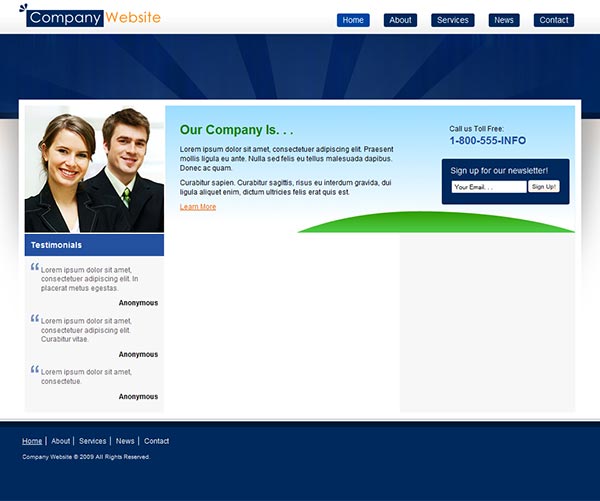
3. It should look like this
Step 8: Add What we Offer
1. Paste the following code into index.htm below the #testimonials div.
<div id = "what-we-offer">
    <h3>What we offer</h3>
    <div class = "content">
        <div class = "item">
            <div class = "icon"><img src = "images/chart.png" alt = "" /></div>
            <div class = "info">
                <h2>Business Planning</h2>
                <p>Aliquam eget orci in leo cursus lacinia. Aenean ultrices augue quis purus suscipit ut congue </p>
            </div>
        </div>
        <div class = "item">
            <div class = "icon"><img src = "images/people.png" alt = "" /></div>
            <div class = "info">
                <h2>Target Marketing</h2>
                <p>Aliquam eget orci in leo cursus lacinia. Aenean ultrices augue quis purus suscipit ut congue </p>
            </div>
        </div>
         <div class = "item last">
            <div class = "icon"><img src = "images/coffee_cup.png" alt = "" /></div>
            <div class = "info">
                <h2>Consultation</h2>
                <p>Aliquam eget orci in leo cursus lacinia. Aenean ultrices augue quis purus suscipit ut congue </p>
            </div>
        </div>
    </div>
</div>
2. Paste the following into home.css
/*
The margin: 0 1px 0 1px adds a white 'line' to the right and left of
#what-we-offer
*/
#what-we-offer
{
	float:left;
	width:460px;
	margin:0 1px 0 1px;
}
Notice in the HTML that we’ve added three divs with the item class. This styles each element to display correctly in the browser. Let’s style these now.
3. Open general.css
4. Paste the following code below .element p
/*======================
 	ITEM
========================*/
/*
Each item is separated by plenty of padding and a soft gray line.
*/
.item
{
	float:left;
	width:100%;
	padding:7px 0 7px 0;
	border-bottom:solid 1px #dfdfdf;

}
/*
The .last element removes the soft gray border.
*/
.last{ border-bottom:0 }
/*
This positions the icon and makes sure that only certain
dimensions are displayed.
*/
.item .icon
{
	float:left;
	width:70px;
	height:70px;
	margin: 0 15px 0 15px;
}
/*
This removes any styling that the images might inherit
from the global image style set in typography.css.
*/
.item .icon img{ border: 0 }
/*
Even though this class doesn't need styling it's good
to declare it anyway for the sake of completeness.
*/
.item .info
{

}
The reason we’re putting this in general.css is because, theoretically, this style won’t be just applied to the home page. When the user visits the services page they will also see this list.
5. It should look like this

Step 9: Adding the events
This last step is going to be very easy since we already styled the events on the about page.
1. Copy and paste the following HTML into index.htm right after #what-we-offer
<div id = "recent-events">
    <h3>Recent events</h3>
    <div class = "content">
        <div class = "event">
            <span>August 9th, 2009</span>
            <a href = "">Vivamus sed lectus est, sagittis iaculis. condimentum hendrerit feugiat </a>
            <p>Sed quis ipsum est. Cras dapibus nisi eu arcu adipiscing eget faucibus mauris tempus.</p>
        </div>
        <div class = "event">
            <span>August 9th, 2009</span>
            <a href = "">Vivamus sed lectus est, sagittis iaculis. condimentum hendrerit feugiat </a>
            <p>Sed quis ipsum est. Cras dapibus nisi eu arcu adipiscing eget faucibus mauris tempus.</p>
        </div>
        <a href = "">More Events</a>
    </div>
</div>
2. Paste the following code into home.css
/*
Recent events is the same width of the light gray column background
*/
#recent-events
{
	float:left;
	width:238px;
	margin-left:1px;
}
The Final Result
After you’ve finished the last step your result should look like this.

Comments
Post by hajan reckiest on September 1, 2009
very good download
Post by Antwan on September 10, 2009
Hey! Thnx for this tutarial, it helped me to understand the basics of slicing and creating a solid -cross browser- webpage. With my PHP expierences this will help me master all elements to create a dynamicly perfect website! PS1: Are you planning to add a part of navigation user firnedly through the menu? PS2: Seems you forgot somethings (I didn't have all the images in te process) and what exactly is the styles.htm for..?
Post by Joshua Bolduc on October 3, 2009
Styles.htm is the place where you can put all your generic html elements (headings, images, paragraphs etc) that you'll use throughout the rest of the website.
It's a great way to see how all the elements will work together and also ensures that you don't forget anything.
Post by Avijit Dey on October 30, 2009
very good to learn in very short period....
Post by pascal on November 4, 2009
Thanks voor the great tut!
Post by Bob on November 9, 2009
Great tutorial. I particularly like your CSS breakdown/organization methodology. Thanks!
Post by Albin on December 13, 2009
Hai! thanks. I am not able to downloade the psd file you have given. It is downloaded without layer i.e., Composited layer (0ne layer). What should I do?
Post by Joshua Bolduc on December 13, 2009
It sounds like you're opening the file with Adobe Acrobat. Make sure you open it with Photoshop.
Post by Twitz on January 24, 2010
Hmmm. Wouldn't it be easier to just do a File / Export to the CSS and HTML after the slices are all added and let PhotoShop create the files for you? :o)
Post by Joshua Bolduc on January 24, 2010
Hi Twitz, That is an excellent question.
There are a few reasons why you shouldn't export directly from Photoshop.
Photoshop doesn't generate standards based code.
The design won't look the same in all browsers.
Photoshop can't create repeating backgrounds which are crucial in pretty much all designs.
Coding it by hand results in much leaner code that downloads faster.
However, exporting from photoshop could be useful for protyping purposes . . .
Post by eve on February 1, 2010
awesome tutorial.. exactly what I needed! Helped heaps xox
Post by peter on February 10, 2010
when i open the Home.psd file in photoshop cs4 on a mac to begin slicing i see a bunch of blue outlines with numbers in the upper left hand corner. What are these and how do i get rid of them so i can see what i'm slicing (and saving because they show up when i'm trying to save the slices as well. thanks i'm a newbie to this.
Post by Bill Miller on February 12, 2010
Great tutorial. It has helped tremendously.
Post by BerggreenDK on November 25, 2012
Just a few comments. First of all, the favicon.ico ought to be placed in the ROOT of a website, as robots and browsers look for /favicon.ico by default. So those not parsing the HTML for shortcut icons etc. will still find it. Secondly, if you shorten your folder paths to images and css, you will generate shorter HTML which again will let your page load faster. If you only include a few images, this might not seem like a lot, but if you have 10000 visitors the difference between placing everything in /images/ versus /g/ addes 5 bytes ekstra download per image. Lets say you have 30 images on a page, thats 30x5 = 150 ekstra bytes pr. page. Then if you have 10000 visitors it addes up to 1.500.000 bytes or more than a megabyte trafik. Same goes for long css descriptions where you dont need them all as they are nested and therefore can be uniquely identified from a top #id or .class. Eg. if you place the footer menu inside footer, you dont need to specify the class/id in the html as there is only one type of inside the footer and that would be the menu. So instead of spending a lot of bytes on each page, you can spend a little extra bytes on the css (which is downloaded and cached between pages when placed in an external file as you already do) and then shorten the HTML a LOT and it will still make sense afterwards when reading it.